
59doit
[ R ] R과 python을 활용한 데이터 분석 시각화 #6(1) 본문
반응형
[ 데이터 시각화 ]
R의 ggplot2 패키지 내 함수와 python의 matplotlib 패키지 내 함수를 사용하여 막대 차트(가로, 세로), 누적막대 차트, 점 차트, 원형 차트, 상자 그래프, 히스토그램, 산점도, 중첩자료 시각화, 변수간의 비교 시각화, 밀도그래프를 수업자료pdf 내 데이터를 이용하여 각각 시각화하고 비교하시오.
# 패키지 및 데이터 불러오기
| library(ggplot2) library(dplyr) data("iris") data("diamonds") data(VADeaths) data(galton) |
- iris 데이터 사용
- diamonds 데이터 사용
- VADeaths 사용
- galton 사용
< R >
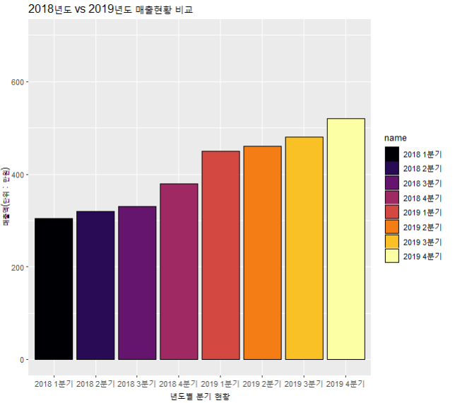
(1) 막대차트
#1 막대차트 데이터
| chart_data <- c(305, 450, 320, 460, 330, 480, 380, 520) names(chart_data) <- c("2018 1분기", "2019 1분기", "2018 2분기", "2019 2분기", "2018 3분기", "2019 3분기", "2018 4분기", "2019 4분기") chart_data_sub <- data.frame(name = names(chart_data) , data = chart_data) |
#2 세로막대 시각화
| ggplot(chart_data_sub, aes(name, data, fill = name)) + geom_bar(colour="black", stat = 'identity') + ylim(0,700) + ggtitle("2018년도 vs 2019년도 매출현황 비교") + ylab("매출액(단위 : 만원)") + xlab("년도별 분기 현황") + scale_fill_viridis(option='inferno', discrete=TRUE) |
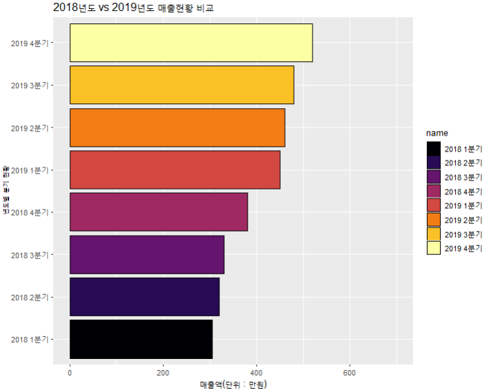
#3 가로막대 시각화
| ggplot(chart_data_sub, aes(name, data, fill = name)) + geom_bar(colour="black", stat = 'identity') + ylim(0,700) + ggtitle("2018년도 vs 2019년도 매출현황 비교") + ylab("매출액(단위 : 만원)") + xlab("년도별 분기 현황") + coord_flip() + scale_fill_viridis(option='inferno', discrete=TRUE) |
(2) 누적막대차트
| ggplot(diamonds, aes(x=clarity, fill=cut))+ geom_bar(colour="black", position='stack') + scale_fill_viridis(option='inferno', discrete=TRUE) |

(3) 점차트
#1 데이터 만들기
| chart_data <- c(305, 450, 320, 460, 330, 480, 380, 520) names(chart_data) <- c("2018 1분기", "2019 1분기", "2018 2분기", "2019 2분기", "2018 3분기", "2019 3분기", "2018 4분기", "2019 4분기") |
#2 시각화
| dot_chart <- data.frame(name = names(chart_data) , data = chart_data) ggplot(dot_chart, aes(data, name)) + ggtitle("분기별 판매현황 : 점차트 시각화") + xlab("매출액") + geom_point(fill = 'white',shape = 21, color = names(chart_data), size = 4, stroke = 5) |

(4) 원형차트
#1 데이터 만들기
| chart_data <- c(305, 450, 320, 460, 330, 480, 380, 520) names(chart_data) <- c("2018 1분기", "2019 1분기", "2018 2분기", "2019 2분기", "2018 3분기", "2019 3분기", "2018 4분기", "2019 4분기") |
#2 시각화
| circle_chart <- data.frame(name = names(chart_data) , data = chart_data) ggplot(circle_chart, aes(x='', y=data, fill = names(chart_data))) + geom_bar(stat='identity', colour="black") + theme_void() + theme() + theme(legend.position = "none") + coord_polar('y',start=0) + geom_text(aes(label=names(chart_data)), position = position_stack(vjust = 0.5), colour = "white") + scale_fill_viridis(option='viridis', discrete=TRUE) |
(5) 상자 그래프
#1 데이터 불러오기
| data(VADeaths) |
#2
| Freq <- as.data.frame.table(VADeaths) |
#3 시각화
| ggplot(Freq, aes(Var2, Freq)) + geom_boxplot() |

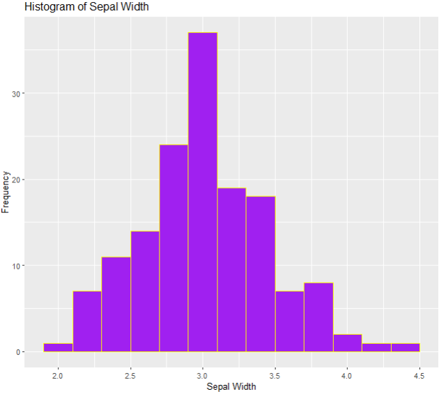
(6) 히스토그램
#1 데이터 불러오기
| data(iris) |
#2 시각화
| ggplot(iris,aes(x=Sepal.Width)) + geom_histogram(binwidth=0.2, color="yellow", fill="purple") + xlab("Sepal Width") + ylab("Frequency") + ggtitle("Histogram of Sepal Width") |
(7) 산점도
#1 데이터 불러오기
| data(iris) |
#2
| ggplot(iris,aes(x=Sepal.Length, y=Sepal.Width, color=Species)) + geom_point(aes(shape=Species), size=1.5) + xlab("Sepal Length")+ ylab("Sepal Width") + ggtitle("Scatterplot") |

(8) 중첩시각화
#1 데이터 불러오기
| data(galton, package = "UsingR") str(galton) |
| 'data.frame': 928 obs. of 2 variables: $ child : num 61.7 61.7 61.7 61.7 61.7 62.2 62.2 62.2 62.2 62.2 ... $ parent: num 70.5 68.5 65.5 64.5 64 67.5 67.5 67.5 66.5 66.5 ... |
#2 데이터 프레임으로 형변환
| galtonData <- as.data.frame(table(galton$child, galton$parent)) str(galtonData ) |
| 'data.frame': 154 obs. of 3 variables: $ Var1: Factor w/ 14 levels "61.7","62.2",..: 1 2 3 4 5 6 7 8 9 10 ... $ Var2: Factor w/ 11 levels "64","64.5","65.5",..: 1 1 1 1 1 1 1 1 1 1 ... $ Freq: int 1 0 2 4 1 2 2 1 1 0 ... |
#3 시각화
| names(galtonData) = c("child", "parent", "freq") ggplot(galtonData, aes(parent, child)) + scale_size(range = c(1,15)) + geom_point(aes(colour = freq, size = freq)) + theme(legend.position = "none") |
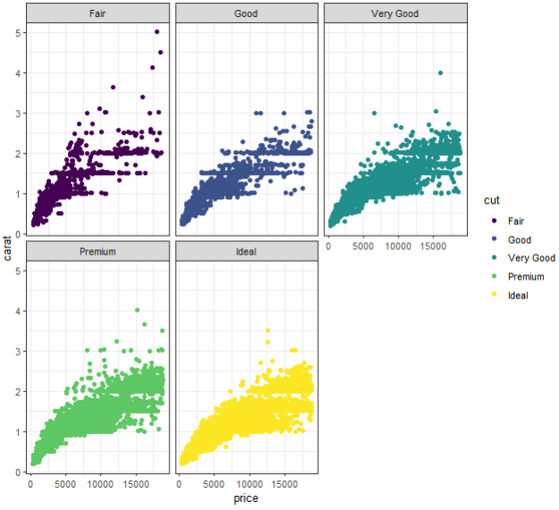
(9) 변수간의 비교 시각화
#1 데이터 불러오기
| data(diamonds) |
#2 시각화
| ggplot(diamonds, mapping=aes(x=price,y=carat)) + facet_wrap(~cut) + geom_point(aes(color=cut))+theme_bw() |
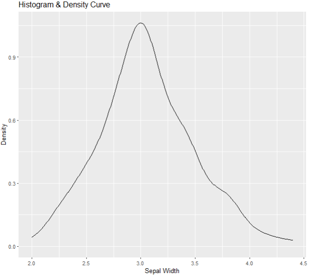
(10) 밀도 그래프
#1 데이터 불러오기
| data(iris) |
#2 시각화
| ggplot(iris,aes(Sepal.Width)) + geom_density() + xlab("Sepal Width") + ylab("Density") + ggtitle("Histogram & Density Curve") |
반응형
'portfolio' 카테고리의 다른 글
| [ R ] R과 python을 활용한 데이터 분석 시각화 #5 (0) | 2023.01.01 |
|---|---|
| [ R ] R과 python을 활용한 데이터 분석 시각화 #4 (0) | 2022.12.31 |
| [ python ] R과 python을 활용한 데이터 분석 시각화 #3 (2) (0) | 2022.12.30 |
| [ R ] R과 python을 활용한 데이터 분석 시각화 #3 (1) (0) | 2022.12.30 |
| [ python ] R과 python을 활용한 데이터 분석 시각화 #2 (2) (0) | 2022.12.29 |
'portfolio' Related Articles
more


Comments