
59doit
[ R ] 데이터 시각화 #2 연속변수 시각화 (2) 본문
(3) 산점도 시각화
산점도(scatter plot): 두 개 이상의 변수들 사이의 분포를 점으로 표시한 차트를 의미
# 산점도 그래프에 대각선과 텍스트 추가하기
#1 기본 산점도 시각화
| price <- runif(10, min=1, max=100) plot(price, col = "red")  |
#2 대각선 추가
| par(new = T) line_chart=1:100 plot(line_chart, type='l', col = "BLUE", axes = F , ann = F)  |
par(new=T) : 기존 그래프 위에 덮어서 그래프를 그릴 수 있다.
ann=F · x, y축 제목을 지정하지 않는다
axes=F · x, y축을 표시하지 않는다.
#3 텍스트 추가
text(70, 80, "대각선추가", col="purple")  |
text() 함수 : text( x, y, labels)
x좌표, y좌표, 표시할 문자열
# type속성으로 산점도 그리기
plot()함수 내 type속성을 이용하여 점을 선으로 연결
| par(mfrow = c(2, 2)) plot(price, type = "l") plot(price, type = "o") plot(price, type = "h") plot(price, type = "s")  |
l : 선으로 표
o : 점위의 선으로 표현
h : 각 값의 높이에 해당하는 수직선으로 표현
s : 계단형으로 표현
cf )
| par(mfrow = c(2, 2)) plot(price, type = "b") plot(price, type = "c") plot(price, type = "n") plot(price, type = "") 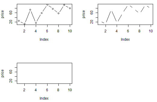 |
b : 점과 선으로 표현
c : b의 선으로 표현
n : 나타나지 않음
# pch속성으로 산점도 그리기
plot()함수 내 pch(plotting character)속성을 이용하여 30가지의 다양한 형태의 연결점 표현 가능
col(color)속성으로 연결점과 선의 색상과 굵기 지정 가능
#1 pch속성과 col, ces속성 사용
| par(mfrow = c(3, 2)) plot(price, type = "o", pch = 5) plot(price, type = "o", pch = 15) plot(price, type = "o", pch = 20, col = "blue") plot(price, type = "o", pch = 20, col = "orange", cex = 1.5) plot(price, type = "o", pch = 20, col = "green", cex = 2.0, lwd = 3)  |
lwd : 선의 굵기 디폴트는 1, ex) 2로 지정하면 두배가된다
cf ) lty : 선의 유형 결정
#2 lwd속성 추가 사용
| par(mfrow=c(1,1)) plot(price, type="o", pch=20, col = "purple", cex=2.0, lwd=3)  |
pch : 점의 모양 지정
col : 색상을 지정
cex : 점의 모양을 확대
lwd : 선의 굵기를 지정
(4) 중첩자료 시각화
2차원 산점도 그래프는 x축과 y축의 교차점에 점(point)을 나타내는 원리로 그려진다. 동일한 좌표값을 갖는 여러 개의 자료가 존재한다면 점이이 중첩되어 해당 좌표에는 하나의 점으로만 표시 중첩된 자료를 중첩된 자료의 수 만큼 점의 크기를 확대하여 시각화하는 방법
# 중복된 자료의 수만큼 점의 크기 확대하기
#1 두개의 벡터 객체 준비
| x <- c(1, 2, 3, 4, 2, 4) y <- rep( 2, 6) x; y # [1] 1 2 3 4 2 4 # [1] 2 2 2 2 2 2 |
#2 교차테이블 작성
| table(x,y) # y # x 2 # 1 1 # 2 2 # 3 1 # 4 2 |
#3 산점도 시각화
plot(x,y) |
#4 교차테이블로 데이터 프레임 생성
| xy.df <- as.data.frame(table(x,y)) xy.df # x y Freq # 1 1 2 1 # 2 2 2 2 # 3 3 2 1 # 4 4 2 2 |
as.data.frame() 함수: 교차테이블 결과를 데이터프레임으로 변환
2차원 그래프에서 같은 좌표에 중복 수를 가중치로 적용 가능
#5 좌표에 중복된 수 만큼 점을 확대
| plot(x, y, pch = "@", col = "blue", cex = 0.5 * xy.df$Freq, xlab = "x 벡터의 원소", ylab = "y 벡터 원소") 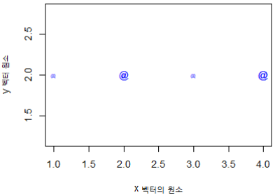 |
# galton 데이터 셋을 대상으로 중복된 자료 시각화하기
#1 galton 데이터 셋 가져오기
| install.packages("UsingR") library(UsingR) data(galton) head(galton) # child parent # 1 61.7 70.5 # 2 61.7 68.5 # 3 61.7 65.5 # 4 61.7 64.5 # 5 61.7 64.0 # 6 62.2 67.5 |
#2 교차테이블을 작성하고, 데이터프레임으로 변환
| galtonData <- as.data.frame(table(galton$child, galton$parent)) head(galtonData) # Var1 Var2 Freq # 1 61.7 64 1 # 2 62.2 64 0 # 3 63.2 64 2 # 4 64.2 64 4 # 5 65.2 64 1 # 6 66.2 64 2 |
as.data.frame() 함수 사용 : 데이터프레임으로 변환
데이터프레임 생성하여 중복 수 컬럼(Freq) 생성
#3 컬럼 단위 추출
| names(galtonData) = c("child", "parent", "freq") head(galtonData) # child parent freq # 1 61.7 64 1 # 2 62.2 64 0 # 3 63.2 64 2 # 4 64.2 64 4 # 5 65.2 64 1 # 6 66.2 64 2 class(galtonData$parent) # "factor" parent <- as.numeric(galtonData$parent) class(parent) # "numeric" class(galtonData$child) # "factor" child <- as.numeric(galtonData$child) class(child) # "numeric" |
factor 형 -> numeric 으로 변환
#4 점의 크기 확대
| par(mfrow = c(1, 1)) plot(parent, child, pch = 21, col = "blue", bg = "pink", cex = 0.2 * galtonData$freq, xlab = "parent", ylab = "child")  |
col : 문자의 경계선 색
bg : 문자의 내부 색
(5) 변수간의 비교 시각화
# iris 데이터 셋의 4개 변수를 상호 비교
| attributes(iris) pairs(iris[iris$Species == "virginica", 1:4])  pairs(iris[iris$Species == "setosa", 1:4])  |
attributes() 함수: 컬럼명 확인
pairs() 함수: matrix 또는 데이터프레임의 numeric컬럼을 대상으로 변수들 사이의 비교 결과를 행렬구조의 분산된 그래프로 제공
# 3차원으로 산점도 시각화
#1 3차원 산점도를 위한 scatterplot3d 패키지 설치 및 로딩
| install.packages("scatterplot3d") library(scatterplot3d) |
#2 꽃의 종류별 분류
| iris_setosa = iris[iris$Species == 'setosa', ] iris_versicolor = iris[iris$Species == 'versicolor', ] iris_virginica = iris[iris$Species == 'virginica', ] |
#3 3차원 틀(Frame)생성하기
| d3 <- scatterplot3d(iris$Petal.Length, iris$Sepal.Length, iris$Sepal.Width, type = 'n')  |
scatterplot3d()함수: 3차원 프레임 생성
scatterplot3d(밑변, 오른쪽변의 컬럼명, 왼쪽 변의 컬럼명, type)
- type 값설명
| “p” | 점으로 |
| “l” | 선으로 |
| “b” | 점과 선 둘다 동시에 |
| “o” | 점과 선 둘다 동시에 (단 겹쳐짐 : overplotted) |
| “h” | 히스토그램과 비슷한 형태로 (histogram) |
| “s” | 계단모양으로 (stair steps) |
| “S” | 계단모양으로 (upper stair steps) |
| “n” | 좌표찍지 않음 |
#4 3차원 산점도 시각화
| d3$points3d(iris_setosa$Petal.Length, iris_setosa$Sepal.Length, iris_setosa$Sepal.Width, bg = 'orange', pch = 21) d3$points3d(iris_versicolor$Petal.Length, iris_versicolor$Sepal.Length, iris_versicolor$Sepal.Width, bg = 'blue', pch = 23) d3$points3d(iris_virginica$Petal.Length, iris_virginica$Sepal.Length, iris_virginica$Sepal.Width, bg = 'green', pch = 25) 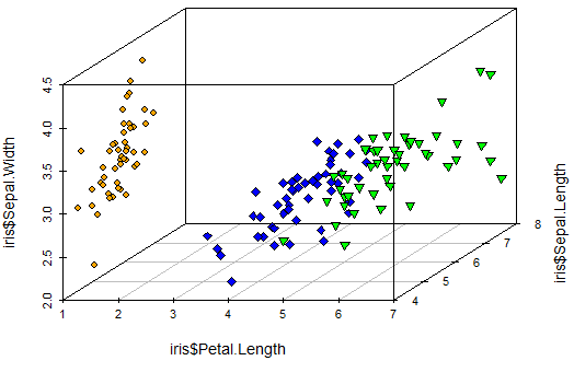 |
'Programming > R' 카테고리의 다른 글
| [ R ] 다양한 시각화 #2 점 ㆍ산점도 그래프 (0) | 2022.12.23 |
|---|---|
| [ R ] 다양한 시각화 #1 히스토그램 밀도ㆍ막대 그래프 (0) | 2022.12.23 |
| [ R ] 데이터 시각화 #2 연속변수 시각화 (1) (0) | 2022.12.22 |
| [ R ] 데이터시각화 #1 이산변수 시각화 (0) | 2022.12.22 |
| [ R ] EDA 표본추출 (0) | 2022.11.21 |


